**Updated with additional research 26th August. I had to go deeper into the rabbit hole...
Yesterday afternoon I saw another article about the ICEBREAKER drama which seems to have gone on for months. At least, that's what I thought.
Turns out, it's been years.
Which, news sites?, seems a little excessive? Obsessive even?
But seeming it's not going away and I haven't found an actual design take, let's delve in.
What is Icebreaker?
ICEBREAKER (Maple Hills #1) by Hannah Grace is a college contemporary romance centered around figure skater Anastasia Allen and her on-ice competition with hockey captain Nate Hawkins after they're forced to share a rink while training for Team USA
Hannah Grace originally self-published Icebreaker in 2022, after a stint on Wattpad, under her imprint, Pig & Bear, named in honour of her dogs. (Which, love). She told New York Times that from the beginning she stressed anonymity. No photos. No tours. No access to her private life as a thirty-year-old married woman with children, even as she swapped her corporate job for full-time smut writing—Sorry, contemporary romance.
Hannah is a real life Trish Murtaugh—(And, if you don't get that reference, go watch Lethal Weapon 1 & 2 now!)—who didn't anticipate the massive audience she'd grow over the next twelve months thanks to Kindle Unlimited and #Booktok. (And probably our ongoing Pandemic trauma that we continually shove deep, deep down).
But Hannah had correctly anticipated, if such a miracle occured, it would be overwhelming; the expectations and demands beyond her capabilities given she's sensory-sensitive. So, she set boundaries to protect herself and stuck to them like an absolute Queen.
Last year, though, she did admit to Simon & Schuster C.E.O, Jonathan Karp—who would later acquire her novels—and New York Times that her first name really was Hannah.

Icebreaker would go on to sell over one million copies. Which brings us to this:

Parents, as a girl who grew up reading Sherrilyn Kenyon, Christine Feehan, Jennifer Estep, and all those OG smutty authors WELL before romantasy was a thang, and well before she should have been, the answer is gonna be noooo. BUT ALSO, maybe a good way to start a healthy sex positive conversation with them if they do get their hands on it?
I don't know, this article isn't about that.
What I want to explore is HOW THE ICEBREAKER COVER HOOKED THE KIDS.
So, let's look at the cover.
The Icebreaker Cover

Due to the rise of generated content trained on stolen intellectual property, plus stock platforms already being plagiarized content infestations, there has been a delightful counter-movement by indie authors in what they commission for their book covers.
We are seeing more and more illustrated book covers come out which is nothing short of wonderful. (Especially for me! Woop!).
Unfortunately, when it comes to book cover art, how "good" you are at said art is only half the battle. The other half is design and marketing.
Who is the Icebreaker Artist?
Leni Kauffman created the book cover art for Icebreaker and its sequels. She's an American-Japanese illustrator living and working in Lisbon and has created some stunning work.

As for her design capabilities, I won't comment on that much as they are standard for her niche. What I want to focus on instead is the choices she made, as an artist, that has caused this controversy. But before we continue, I just want to put it out there:
Cartoon does NOT = children content.
That generalisation is just not productive.
Much like any genre code, there are subtle cues you need to be faithful too if you want to properly communicate with your intended demographic and not accidently blur lines.
And it HAS been standard for Under 18 novels to be cartoon and flat design style for years.
Well before it was "appropriated" by general audience and adult books.

As an example, Slate writer, Heather Schwedel, does a great article on the use of minimlist "flat" style illustration in traditional publishing starting with her hypotheised "patient zero" WHERE'D YOU GO, BERNADETTE by Maria Semple (2012).

Keith Hayes, who designed the cover for publisher LITTLE, BROWN, told Schwedel that he didn't intend to use the flat design style, or start a trend. It came about simply due to his "inability to actually draw". But start a trend it did including the stunning CRAZY RICH ASIANS cover the following year that elevated Hayes' original concept.

But this "patient zero" book as Schwedel calls it came out six months after WONDER by R. J. Palacio.
The simarlities, while not overt due to style, are still undeniable. This is why we must consider the canon of style when discussing these issues. Context is always key!
We do not live in a vacuum. We are influenced constantly by a barrage of information ambushing us every second of every day. Denying its influence is denying your own learning and unconscious communication with the media you consume.
So while, NO, illustration and cartoon does not equate children content; we do need to take into consideration that for some time this visual aesthetic has been assigned to a certain demographic. This means there is an assumption by consumers.
But, for just as long, there has been a clear visual language developed to ensure audiences know exactly who is targetted by art when the lines are blurred.
Icebreaker missed these cues.
First Error: Age Representation
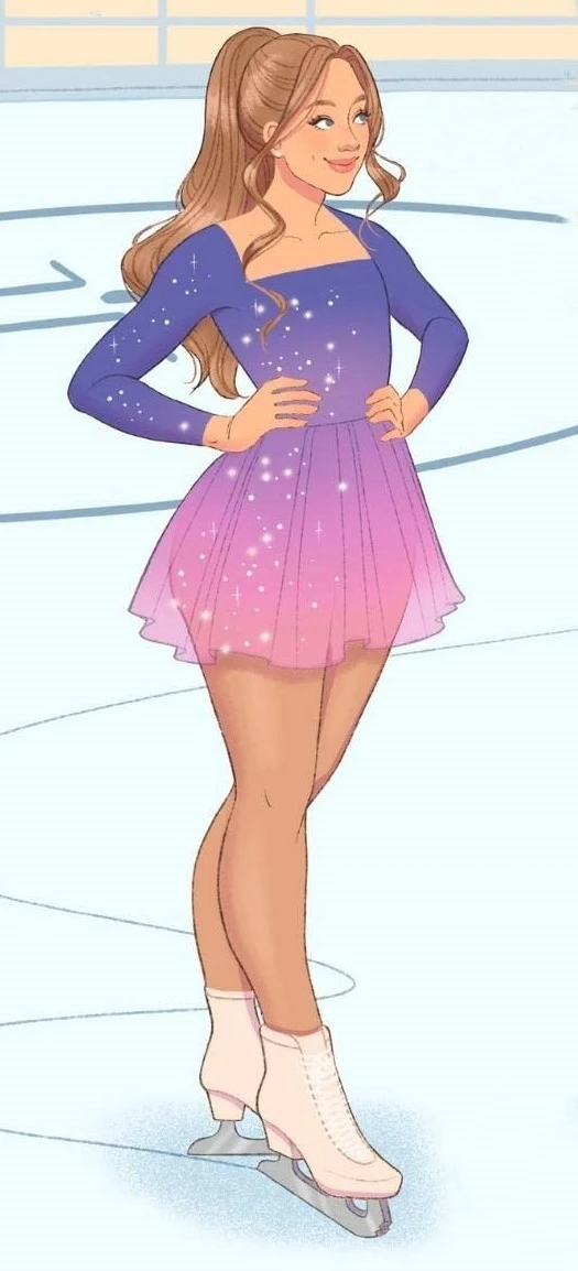
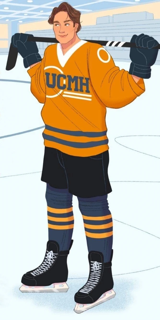
The main characters Anastasia (which is 50 shades of funny) and Nate are both in their early twenties. At a glance, however, these character designs could easily pass for what Hollywood deems as appropriate adolescent casting between 13 and 18 years old. Therefore, without knowledge of the series, you could assume these characters are young adults.
Why do they look young?
Two things primarily: Anastasia being "flat-chested". Obviously, this is common for athletes at her level. But it is the opposite for what we visually expect from a "chest-heaving" novel. I remember reading somewhere that, when it comes to general smut, all women and men must have big attributes haha It was apparently mandatory outside niche kink.
Second, Nate being "baby-cheek" boyish. I think that speaks for itself haha
Based on these characteristics, and then paired with their innocent, if bashful, body language with each other—(That's some mega distance for the holy spirit between them girl)—Leni has accidently made their ages ambiguously young.
I wouldn't blink twice if someone said this was set in an American highschool. For all I know, UCMH is the name of their Highschool. I only discovered it was a University when I read the blurb earlier.
Now compare this to Harlequin's BODY CHECK by Elle Kennedy.

First off, the "comprimising" position clues us in immediately that this book is romance-centered well before we even check the title. There is no sweet, bumbling awkward distance between these characters!
Next we have the clothing: The woman is clearly in professional work attire while the male has a numbered jersey which, paired with no other information, leads us to assume he is either a professional player or at least adjacent.
Finally, we have their faces: In highschool many, if not most of us, didn't get to wear makeup outside of concealer, so by giving the woman a bold lip, you're reaffirming her maturity because she's allowed. The male character also has a nice strong jawline.
Second Error: Colour Scheme
Icebreaker has a very whimiscal colour scheme that has little dark contrast outside of Nathan's uniform. With all the soft blues and Anastasia's gliterry purple to pink outfit, it shouts innocence which isn't helped by the fact we already associate "ice" with purity, even eternal youth.
There is also no visual conflict or coded colours here to key us in to the explicit sex waiting behind the cover. Not even a touch of warmth to infer passion.
For a novel that allegedly contains, beyond the obvious, disordered eating and in-text sexual assault, we aren't given anything by the cutesy cover to warn us—or hook us for that matter.
Now compare it with another ice skater / hockey player romance. . .

Look at that heat! That action! (That jawline...)
What All This Means

Look, cute cover art hiding ultra-spicy stories is the new apple and tie incognito mode.
We saw this pop up years ago with TWILIGHT and 50 SHADES where intentional design choices were made to blur genre codes to both broaden demographics and ensure reading these books in public didn't raise eyebrows.
Is it a mystery? Is it a thriller? No, it's virgin / billionaire porn.
But these books still abided by codes.
Say what you will about the stories, but their designs are a masterclass in marketing.

50 SHADES clearly targets a mature audience with coded imagery. Its cover for all standard purposes is boring—unless you were "in the know". It's classic wink-wink cult marketing that we gush over. And, it may seem so simple, but that tie? It's doing SO much heavy lifting. That tie not only tells you the billionaire trope, it shouts THIS IS VANILLA-KINK MUMMY PORN.
Genius.
Now, can you think of another book, also centered on a universtiy lass called Anastasia, who gets her sexy times on?

Are you starting to see the issue?
Thanks to #booktok primary school kids are "allegedly" gobbling up the steam and spice while parents are unwittingly buying it for their young teens—Because that IS who it visually targets.
I can't help but hypothesise this is partially by design.
Not by Hannah Grace. Or Leni. I do think they just wanted to make a 'cute' cover. They also had saftey in being isolated within their demographic and niche reach.
But when Simon & Schuster decided to purchase the original cover art license for wider distribution, they HAD to know. I mean. Someone in the art department or marketing at least must have been shouting: But who is this even for? Because babe I dunno.
To me, this cover shouts "Innocent All American Sweetheart Highschool Romance" like its the lost sibling to Disney's ICE PRINCESS. (Which is funnily enough written by Meg Cabot, creator of Princess Diaries. The more you know!).
But, end of day, sales are sales.
Why wouldn't publishers choose to captalise on this "soft deception" as long as there's deniability. It's clearly getting them sales. (And I honestly wouldn't be surprised if a few parents are just thrilled their kid's reading).
So, while the cover is not technically good in representing its story: It's done its job.
I mean, who here can scoff at over one millions sales, hey? Not me!
(But, for real, parents please check what your kids are reading... and watching, and talk).
ABOUT DESIGN BY DAYNA
Dayna is an Australian creative, working globally, to assist freelancers and brands to enable their visual storytelling and practices. From Netflix Documentaries and Best Selling Authors to international and small businesses, Dayna has provided design and creative solutions across a range of mediums. She now focusses on creating striking illustrated book covers. Enquire now to bring your creative narrative vision to life.


Comments